Boolean Editor
Table of contents
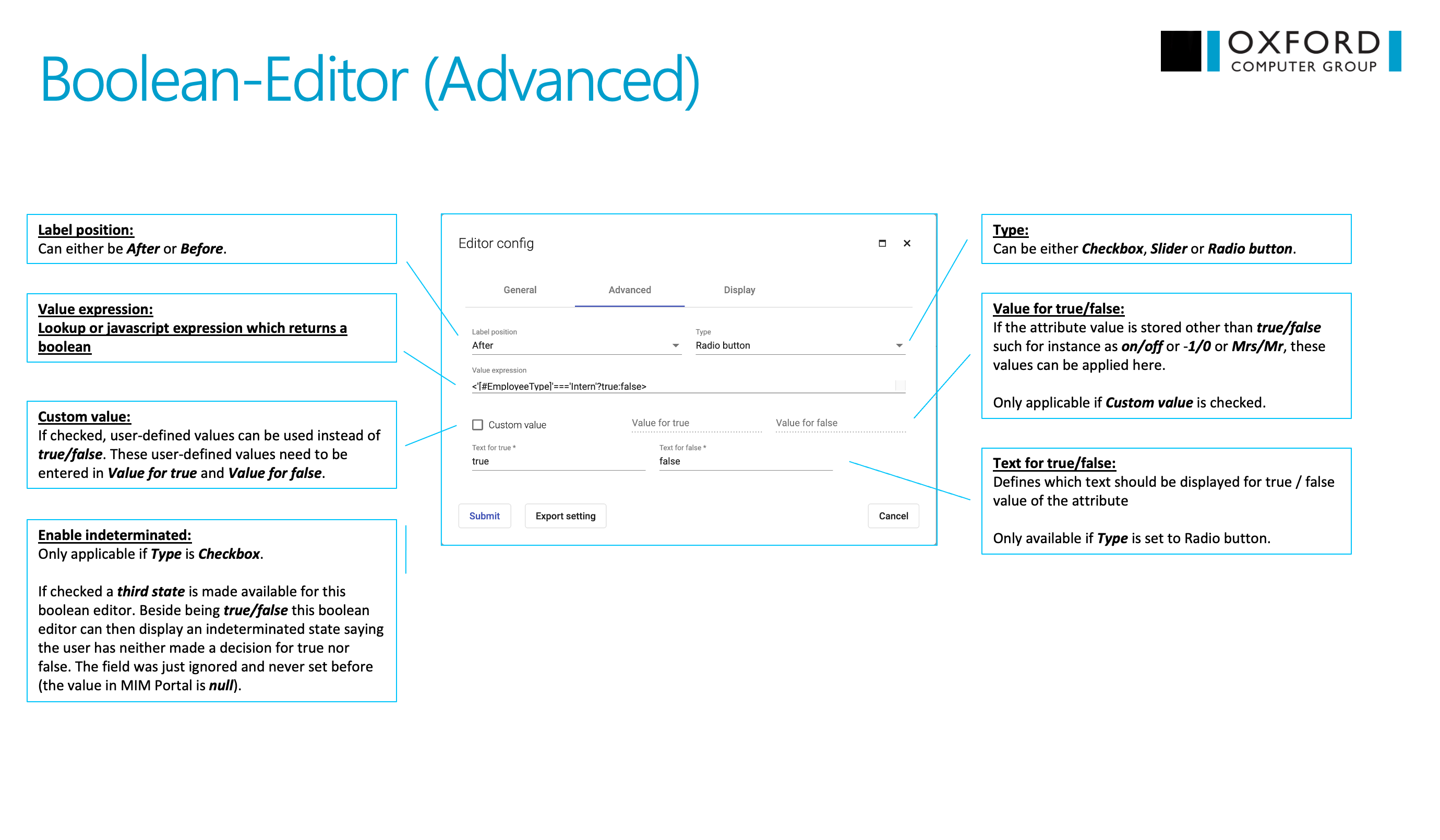
Configuration
| Property name | Default value | Annotation |
|---|---|---|
| controlType | checkbox | defines the boolean editor control type, allowed values are checkbox, slider and radio |
| customValue | false | if set to true, custom value can be used to represent the boolean value (true or false) |
| enabledIndeterminated | false | if set to true, the boolean editor has 3 (true, false, indeterminated) states instead of 2 (true, false) |
| falseText | undefined | used to represent the true value, only takes effect if customValue is set to true |
| radioButtonLayout | row | defines the radio button layout direction, allowed values are row and column |
| readiobuttonSpace | 20 | defines the space in pixel between radio buttons |
| textAlign | after | defines the position of the label for checkbox / slider / radio button. allowed values are before and after |
| trueText | “true” | defines which text should be displayed if attribute value is true, only takes effect if controlType is set to radio |
| falseText | “false” | defines which text should be displayed if attribute value is false, only takes effect if controlType is set to radio |
Configuration in UI
Event handler
onFocuse()
Triggered if the boolean editor get focus
onChange()
Triggered if the value of the boolean editor has been changed