Detail Views
Table of contents
Scenario
A Detail View shows attribute information about a specific Object/Resource separated in three units named:
- Detail View (always visible)
- Brand View (can be hidden or visible showing custom attributes)
- Structure View (can be hidden or visible showing a custom structure)
The anatomy of a Detai View having all units enabled could look like:
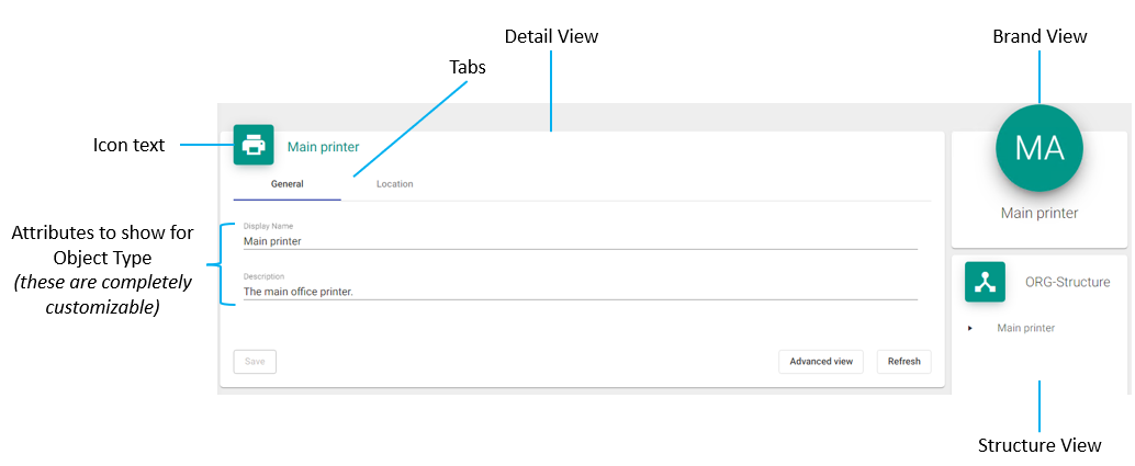
Detail View
This view shows an configurable Google Material Icon followed by the DisplayName of the selected resource. Attributes can be configured and positioned in different Tabs for logical separation of information and/or human-readablity. The image above shows two tabs General and Location having the first one selected. The attributes configured (DisplayName and Description) do show their concurrent value and can be modified by the user.
If attribute values are changed by the user the Save-Button will be enabled and needs to be pressed before leaving the view in order to store changed values in the MIM Portal.
The Advanced view-Button switches into advanced attributes view as available in the MIM Portal as well showing all attributes bound to the concurrent resource.
With the Refresh-Button the user can refresh the view in case attribute values were changed from somewhere else (manually by another user or automatically via workflow).
Brand View
This view can be hidden or visible showing the generated initials (MA) and custom attributes for the selected resource. The Initials are build by using the first two letters of the DisplayName.
Structure View
This view can be hidden or visible showing Parent/Child-Relations about the selected resource within a tree structure. This is useful to quickly see and access organizational unit information about the selected resource.
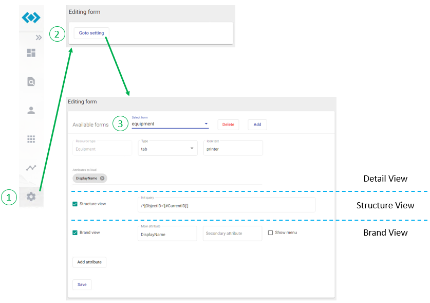
Configration
Detail View
A detail view is usually accessed by clicking on a resource, found as search result, displayed as Grid-Entry or elsewhere within the IDABUS® UI showing a resource. For our Equipment-Sample from the previous chapters we might go the following way that ends up with Oops… something went wrong:
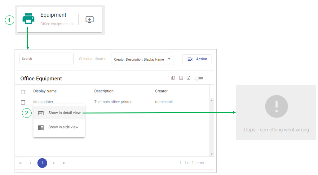
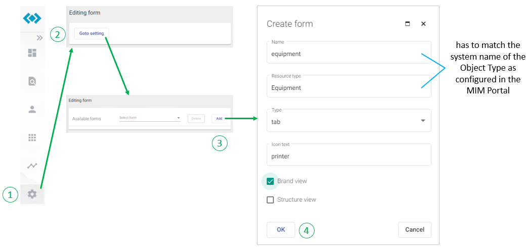
This happens because the IDABUS® UI is missing a configuration for this type of resource yet. Once configured and stored in the MIM database the detail view is available globally for all administrators and users. To create a new Editing form please follow the steps below:
Having the steps performed a user shoud now be routed to the Equipment-Detail View correctly when clicking on a resource of this type and see an empty/unconfigured view like in the first screenshot of this page except the Structure View.
The administrator can now start adding Tabs and/or Attributes to this detail view by:
- Switch into Edit-Mode via clicking
 at the top right of the page.
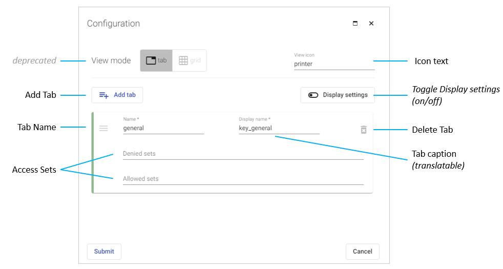
2a. To add, delete or modify a Tab on the view click  . The following dialog opens:
2b. To add a new Attribute to the view and concurrently selected Tab click  . The following dialog opens:
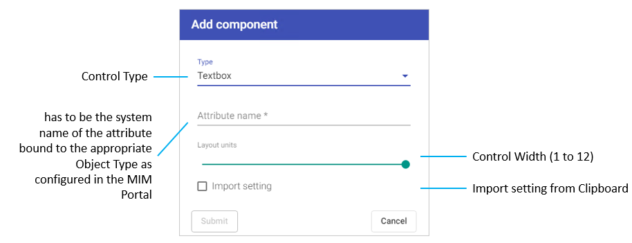
The following Control Types are available:
- Textbox (for Strings)
- Checkbox (for Booleans)
- Select (can be DropDown or RadioButton)
- Date (for Dates and/or Times)
- Identity-Picker (for References)
- Identity-List (for Memberships)
- Button (for custom Angular methods - Advanced Training required!)
- XPath-Editor (for criteria-based Filters)
- Separator (for on-screen separation-purposes)
- Frame (for custom Angular components - Advanced Training required!)
3. Complete the operation by clicking the save icon  .
.
Brand View & Structure View
The brand and structure view properties can be configured in the Settings-Area of the IDABUS® UI following these steps: