As described earlier the IDABUS UI® frontend settings are configured in the “customConfig.dev.json” file (or if IDABUS UI® is published with the –prod option) in the “customConfig.prod.json” file respectively. Most of these settings are also available in the frontend (so called Variables configuration) and will overwrite the file configurations.
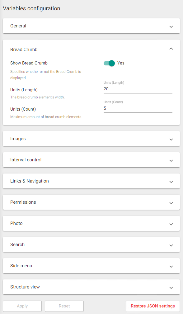
To open the Variables configuration (granted to people with administrative permissions for the loaded UI View Set only) click on Settings (Sidebar) > Goto setting (Variables configuration). The settings in the Variables configuration are categorized and more descriptive than their fallback settings in the JSON-files. The settings can also be configured using UI controls best appropriate for their data type (e.g, Color-Picker for colors, Numeric Up/Down input fields for numbers, Switches for booleans, etc.):
While changing settings both the Apply- and the Reset-Button are enabled in order to either store the changed settings or return to the settings that were present before the change. Once settings are applied or reset both buttons are disabled again until the next settings change is registered.
Applied changes won’t be stored in the JSON-file, only in the concurrent UI View Set (MIM-Portal database). For settings that were never touched the origin is still the JSON-file. This means that the settings are a merged object from both the JSON-file and the UI View Set. First the JSON-file settings are loaded and then overwritten by settings saved in the UI View Set.
To reset/delete all settings made in the UI, press Restore JSON settings. This will delete all customized settings from the UI View Set and completely return to the fallback settings made in the JSON-files.
General
Key
Description
Page title
Specifies the text in the Browser-Tab.
Page size
Specifies the amount (5 to 200) of page elements to be loaded for Grids/Tables.
Login user attributes
Specifies one or more user attributes that are automatically loaded into memory when a user logs in to IDABUS UI®.
Attribute font-size
Specifies the font size (6 to 30) used for attributes.
Wizard-Position (Top)
Specifies the top position in pixels (0 to 10000) for wizard-popups.
Bread Crumb
Key
Description
Show Bread-Crumb
Specifies whether or not the Bread-Crumb (below the Search all resources bar) is displayed.
Units (Length)
Specifies the element width (10 to 50) for the Bread-Crumb.
Units (Count)
Specifies the maximum amount (1 to 10) of elements to be displayed in the Bread-Crumb.
Images
Key
Description
Splash (Background-Color)
A CSS-color code specifying the background color of the Splash-Screen. Alternatively a color picker can be used to select a color.
Splash (Animation-Color)
A CSS-color code specifying the animation color of the Loading-Dots in the Splash-Screen. Alternatively a color picker can be used to select a color.
Splash (Logo)
Specifies the relative path (ideally starting with assets/img/) and file name to the Splash Logo-Image.
Splash (Logo-Height)
Specifies the height (1 to 1000) of the Splash-Logo in pixels.
Sidebar-Logo (large)
Specifies the relative path (ideally starting with assets/img/) and file name to the large Sidebar-Logo.
Sidebar-Logo (large height)
Specifies the height (1 to 1000) of the large Sidebar-Logo in pixels.
Sidebar-Logo (small)
Specifies the relative path (ideally starting with assets/img/) and file name to the small Sidebar-Logo.
Sidebar-Logo (small height)
Specifies the height (1 to 1000) of the large Sidebar-Logo in pixels.
Favorites Icon
Specifies the relative path (ideally starting with assets/img/) and file name to the favorites icon.
Interval-control
Key
Description
Tiny
Specifies tiny delays in milliseconds (10 to 5000).
Small
Specifies small delays in milliseconds (10 to 5000).
Middle
Specifies middle delays in milliseconds (10 to 5000).
Large
Specifies large delays in milliseconds (10 to 5000).
Ultra
Specifies ultra long delays in milliseconds (10 to 5000).
Links & Navigation
Key
Description
Navigate to created object after creation
Automatically navigate to created resources after creation by default if on.
Link actions
The available link actions in the context menu for Identity-Links.
Default link action
The default action to take place when clicking on Identity-Links.
Permissions
Key
Description
Administrators-Set
The name of the MIM Administrators-Set (usually called Administrators).
Advanced View Permission
The MIM-Portal Set-Names for people with Advanced View Permission.
Preview Permission
The MIM-Portal Set-Names for people with Preview Permission (not available in OnPrem).
Hide ‘no read access’ messages
Specifies whether or not the ‘no read access’ information should be hidden in attribute views if the user has no read access to the indicated attribute(s)/resource.
Hide ‘no write access’ messages
Specifies whether or not the ‘no write access’ information should be hidden in attribute views if the user has no write access to the indicated attribute(s)/resource.
Photo
Key
Description
Photo-Attributes
The names of attributes that contain photos.
Width-to-Height ratio
Specifies the size ratio to be used for photos.
Usually set to 1 which means same ratio is used for width and height.
If you set this value to 2 then the ratio used for width is 2 times bigger than the ratio used for height.
Setting this value to 0.5 means that the ratio used for height is 2 times bigger than the ratio used for width.
Search
Key
Description
Enable auto-complete
Specifies whether a search is triggered automatically or manually (pressing ENTER).
Letters to toggle
Number of charachters (1 to 10) required to trigger an automatic search.
Side menu
Key
Description
Floating
Specifies whether or not the Sidebar should be displayed floating/overlapping other elements.
Background color
A CSS-color code specifying the background color of the sidebar. Alternatively a color picker can be used to select a color.
Foreground color
A CSS-color code specifying the foreground/text color of the sidebar. Alternatively a color picker can be used to select a color.
Icon color
A CSS-color code specifying an icon color for the sidebar. Alternatively a color picker can be used to select a color.
Structure view
Key
Description
Init query
The XPath-Query to be used to load the structure view elements.
Children query
The XPath-Query to be used to load any children elements in the structure view.