Button Editor
Table of contents
Configuration
| Property name | Default value | Annotation |
|---|---|---|
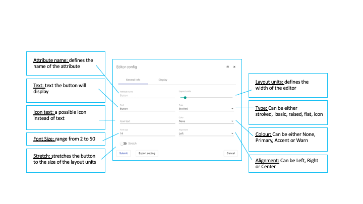
| align | start center | defines where the button will be placed. The available options are right, left and center |
| color | undefined | Standard: The button is displayed in black colour. Other options are primary (blue colour), accent (green colour) and warn (red colour) |
| fontSize | 14 | defines the size of the font. The allowed values are in the range from 2 to 50 |
| icon | undefined | Possibility to use an icon instead of a button text |
| stretch | false | if set to true, the button will extend to the entire layout units |
| style | stroked | describes how the outline of the button looks like. Allowed values are stroked, basic, raised, flat, icon. |
| text | Button | defines the name of the button or what is written on the button |
Configuration in UI

Event handler
onClick()
creates a new Event with the following attributes: AttributeName, ObjectID (currentID), objectType