Select Editor
Table of contents
Configuration
| Property name | Default value | Annotation |
|---|---|---|
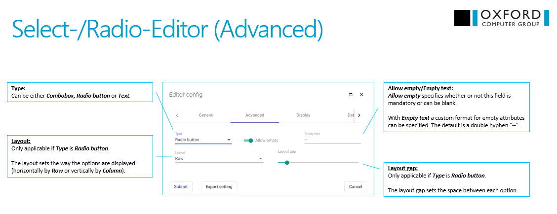
| allowEmpty | true | choose if select editor can have empty value |
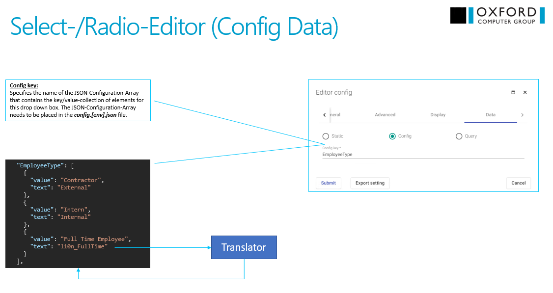
| configKey | undefined | specifies the name of the JSON-Configuration-Array that contains the key/value-collection of elements |
| controlType | combo | defines the select editor control type, allowed values are combo, radio and text |
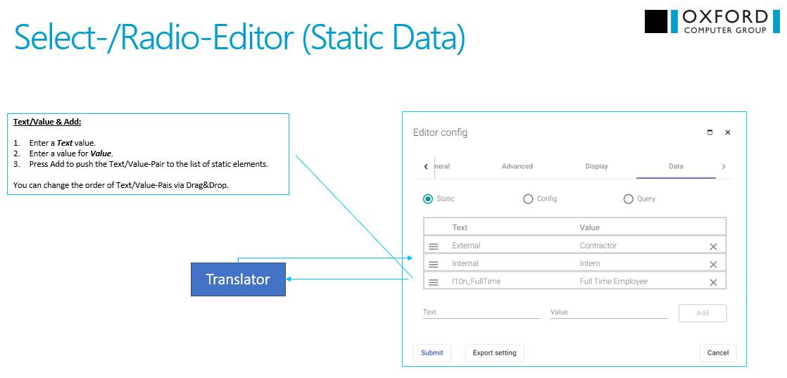
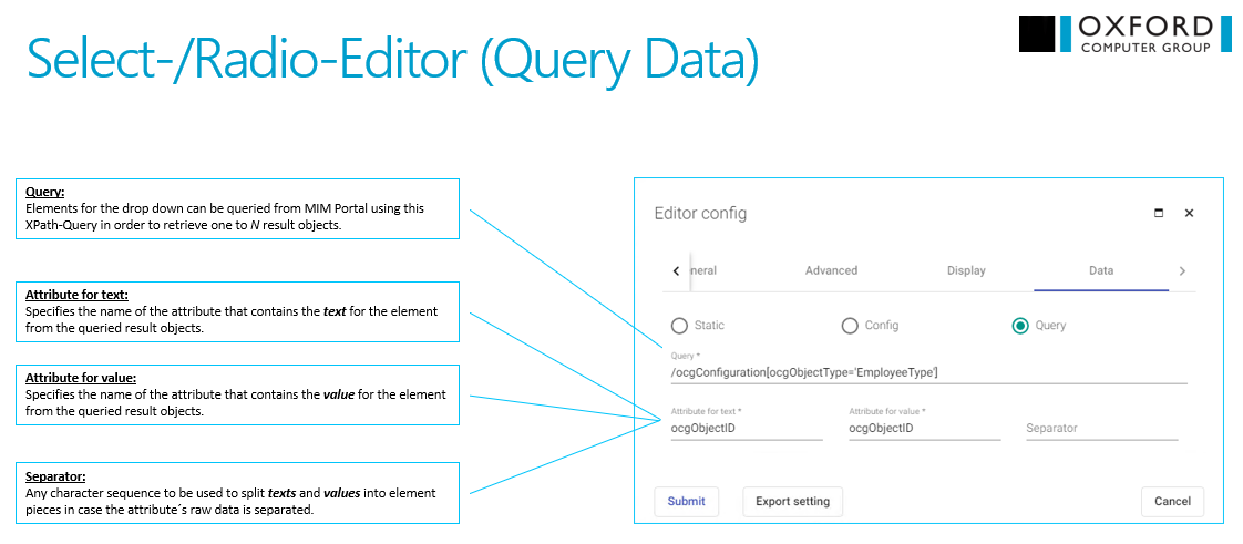
| dataMode | static | specifies the type of data for select editor, allowed values are static, config and query |
| emptyText | ’–’ | specifies custom format for empty text |
| options | [] | list of options for select editor |
| query | undefined | XPath-Query for values in select editor |
| radioButtonLayout | row | defines the layout of radio butto, allowed values are row and column |
| radioButtonSpace | 20 | sets the space between each option |
| separator | undefined | character sequence to be used to split texts and values into element pieces in case the attribute´s raw data is separated |
| textAttribute | undefined | specifies the name of the attribute that contains the text for the element from the queried result objects |
| valueAttribute | undefined | specifies the name of the attribute that contains the value for the element from the queried result objects |
Configuration in UI
Event handler
onFocuse()
Triggered if the select editor get focus
onChange()
Triggered if the value of the select editor has been changed