Search Scopes - Part 3
Table of contents
Scenario
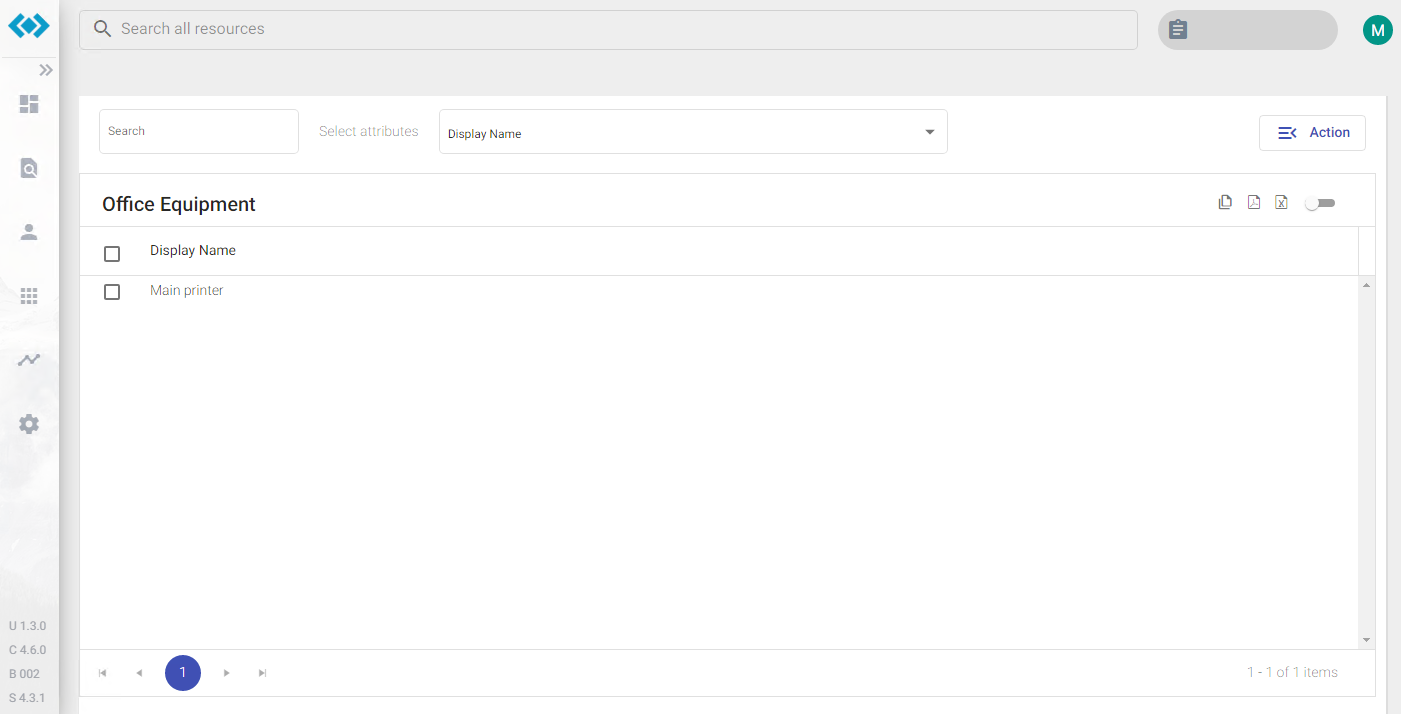
In Part II we added a new Action Card for Office Equipment and configured it to display available office equipment on “primaryAction” in the Resource-List below:

The Resource-List displays only one column DisplayName. In the following steps we’ll add more columns to this list.
Configuration
Columns are configured in the custom configuration file within the “searchScopes”-section: C:\inetpub\Oxford Computer Group\IDABUS UI\portal\app\customisation\assets\config\customConfig.dev.json
There are two ways to configure columns, or let´s say to display more MIM attribute information for the displayed objects:
- using a simple array of strings only (“attributes”), or
- using a complex array of Column-Definitions additionally (“columns”)
Simple Array of Strings
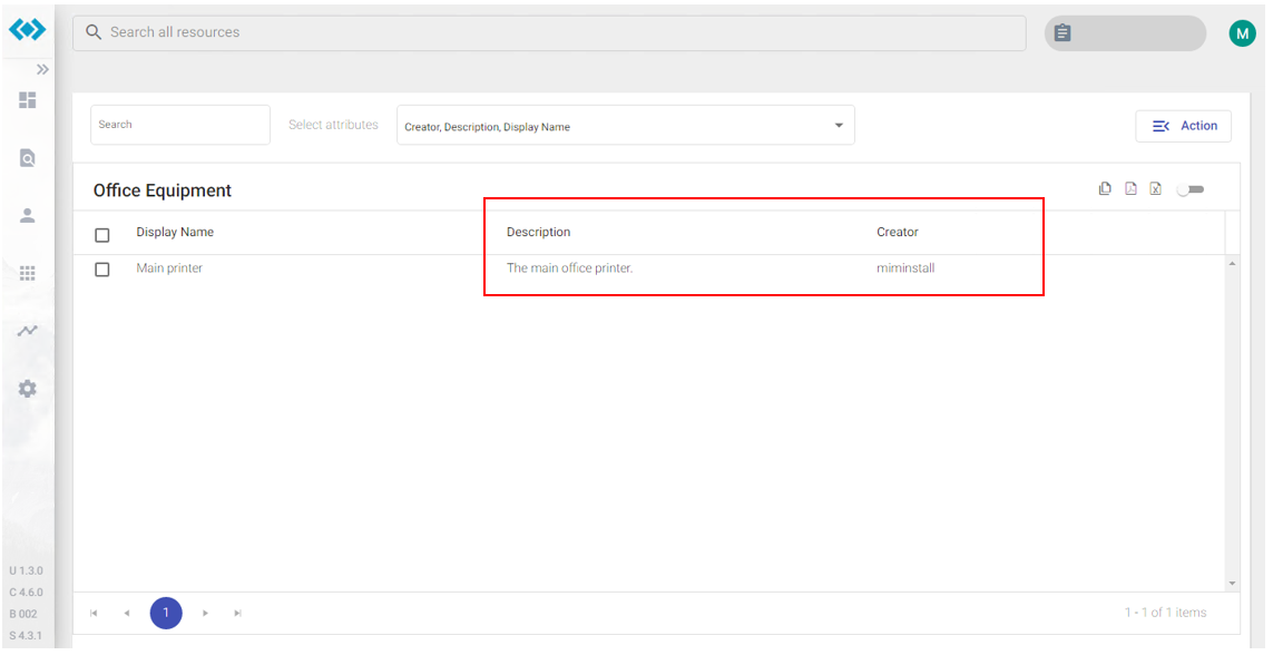
This configuration is done quickly by just providing an array of strings containing attribute names bound to the specified Object Type. All columns will be displayed with the same width and in the order provided in the array. To add Description and Creator information to the list change the “attributes”-array in the “searchScopes”-section for EquipmentScope to:
["DisplayName", "Description", "Creator"]
Saving the file and refreshing the page will now show the following list:

Complex Array of Column-Definitions
This configuration is more precise to how columns should appear in the list and what options are available for the user. With this configuration we can define:
- if columns should be “sortable”
- if columns should be “filterable”
- a specific column “width”
- status indicators using the “showStatus” configuration
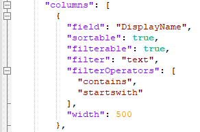
A Column-Definition looks like this:

Parameters
Search Scopes
| Key | Description | Values |
|---|---|---|
| attributes | A simple array of MIM attribute names bound to the current Object Type. This array is required. | string[] |
| columns | This array is optional and can contain more precise column definitions for the columns specified in “attributes”. | Column-Definition[] |
Column-Definition
| Key | Description | Values |
|---|---|---|
| field | Specifies the name of the attribute as specified in “attributes” in order to apply the following column properties. | string |
| sortable | If true the user will be able to click the column header to toggle sorting (unsorted > asc > desc). | true/false |
| filterable | If true the user will be able to click a filter symbol in the column header to apply custom filtering on this column. To make filters work properly, the correct data type of the attribute needs o be specified in “filter”. | true/false |
| filter | Specifies the data type for this attribute/column if “filterable” is set to true. If Text-Filtering is applied to a column containing numbers or dates, filtering won’t work correctly! | text/ number/ boolean/ date |
| filterOperators | This is not needed anymore with v.4.7 If “filterable” is set to true this property defines filter operators. Available operators are: "contains", "starts-with", "equals", etc. (See advanced search filter for all possibilities) | string[] |
| width | Specifies a dedicated width (px) for this column. | number |
| showStatus | Specifies whether or not this column should indicate a status based on the attribute value. | Status-Configuration |
Status-Configuration
If the “showStatus” property is present for a specific column, it is configured with the following parameters:
| Key | Description | Values |
|---|---|---|
| trueValue | If the Object´s attribute value matches the string specified, the status will be shown as true. otherwise it will be shown as false. | string |
| trueText | If the Object´s attribute value matches the string specified in “trueValue” this string is shown as status. | localizable string |
| trueColor | Specifies the icon color for the true status using a valid CSS Color code like:#00ff00 or green | CSS Color |
| falseText | If the Object´s attribute value does not match the string specified in “trueValue” this string is shown as status. | localizable string |
| falseColor | Specifies the icon color for the false status using a valid CSS Color code like:#ff0000 or red | CSS Color |
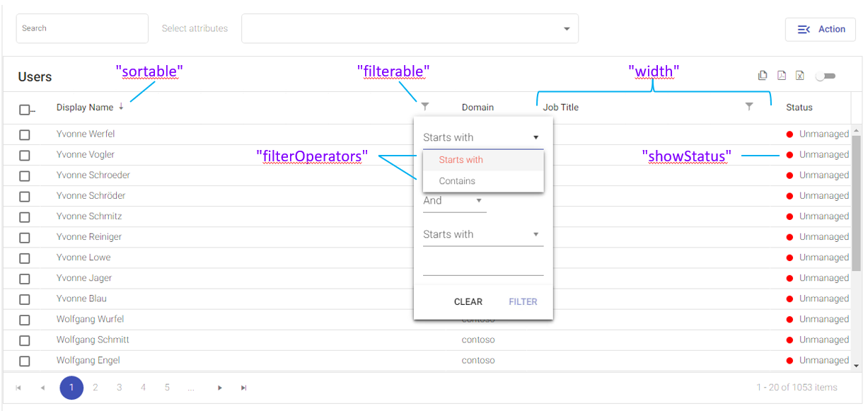
Users-List
On a newly installed system a sample with the Status-Configuration can be seen in the Resource-List for users:
