Sidebar Settings
Table of contents
Scenario
The sidebar is available in two modes (when being expanded):
- Floating (overlapping)
- Unfloating (side-by-side)
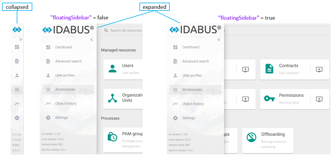
The sidebar contains the following elements (top to bottom):
- Logo-Image(s) (small and big)
- Expand/Collapse-Button
- Configurable Routes (Dashboard, Advanced Search, etc.)
- Version-Information (as displayed in the screenshot):
- UI version: Can be adapted whenever you make an individual UI customization (displayed as 1.3.0)
- Core version: Internal Core-Build-Version from OCG (displayed as 4.6.0)
- Version build: Internal OCG versioning (displayed as 002)
- Service version: Version of the OCG DataService connected via “dataServiceUrl” (displayed as 4.3.1)
Configuration
The sidebar settings are stored and configurable in the following file C:\inetpub\Oxford Computer Group\IDABUS UI\portal\app\customisation\assets\config\customConfig.dev.json and following sections:
- “images”
- “sidebarSettings”
- “sidebarItems”
Parameters
Images
| Key | Description | Values |
|---|---|---|
| logoSplash | A relative path to an image file that is accessible within the customization folder and shown on the splash screen of the IDABUS® UI:C:\inetpub\Oxford Computer Group\IDABUS UI\portal\Example: app/customization/assets/img/idabuslogosplash.pngIf the img folder is not yet present, please create it. | relative path |
| logoLarge | A relative path to an image file that is accessible within the customization folder and shown in the sidebar as large logo:C:\inetpub\Oxford Computer Group\IDABUS UI\portal\Example: app/customization/assets/img/idabuslogo.pngIf the img folder is not yet present, please create it. | relative path |
| logoSmall | A relative path to an image file that is accessible within the customization folder and shown in the sidebar as small logo:C:\inetpub\Oxford Computer Group\IDABUS UI\portal\Example: app/customization/assets/img/idabusfavicon.pngIf the img folder is not yet present, please create it. | relative path |
Sidebar-Settings
| Key | Description | Values |
|---|---|---|
| backColor | A CSS-color code specifying the background color of the sidebar. | CSS Color |
| frontColor | A CSS-color code specifying the foreground/text color of the sidebar. | CSS Color |
| iconColor | A CSS-color code specifying an icon color for the sidebar. | CSS Color |
Sidebar-Items
| Key | Description | Values |
|---|---|---|
| name | Specifies a name for this element. | string |
| path | Specifies the target route to be launched when the user clicks on the sidebar element. (Advanced Training required) | Route |
| title | A translatable string that is shown as tooltip for this sidebar element. | translatable string |
| icon | Specifies the Google Material Icon to be used for this sidebar item. | string |
| enabled | If false, the sidebar item will be hidden. | true/false |